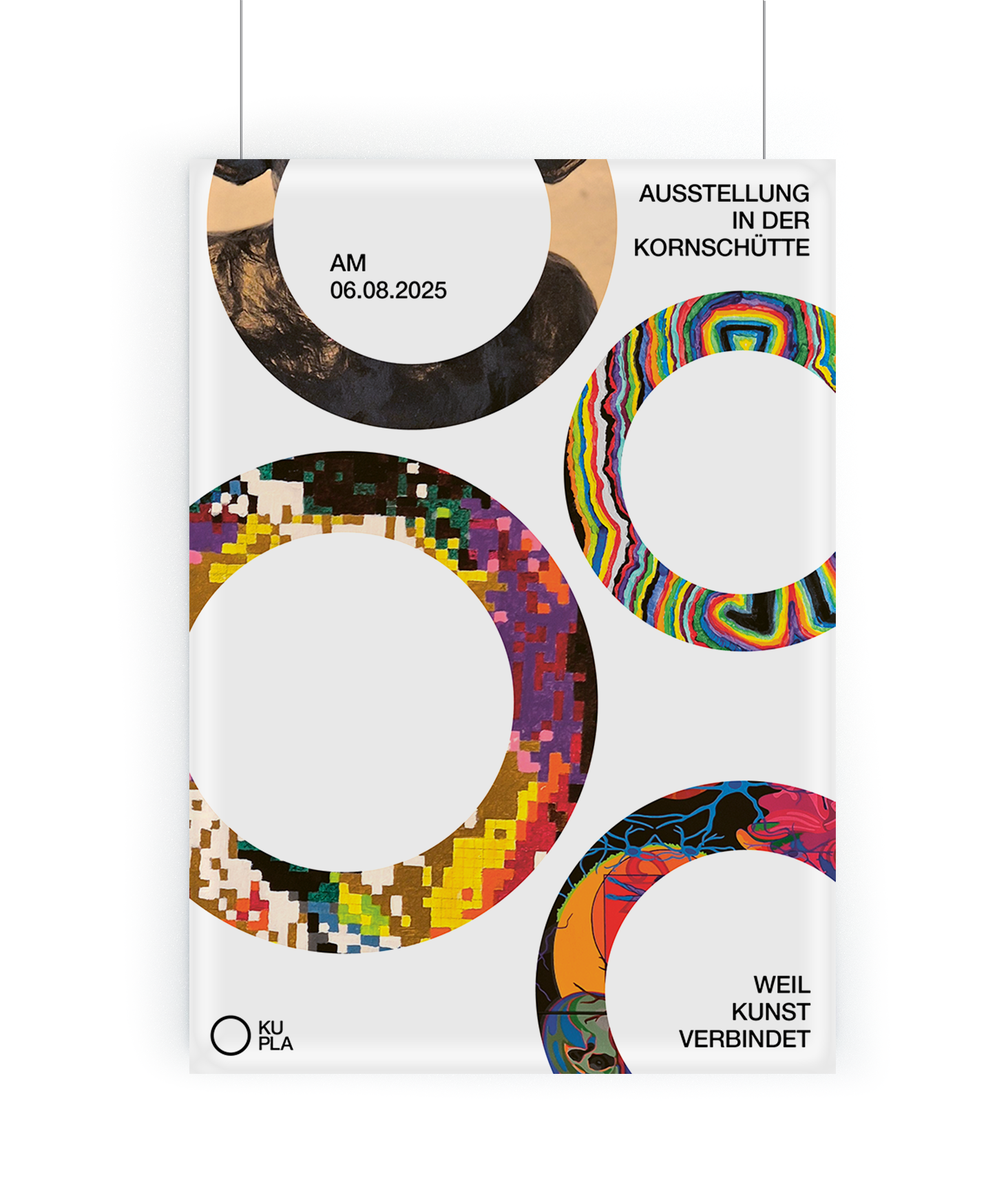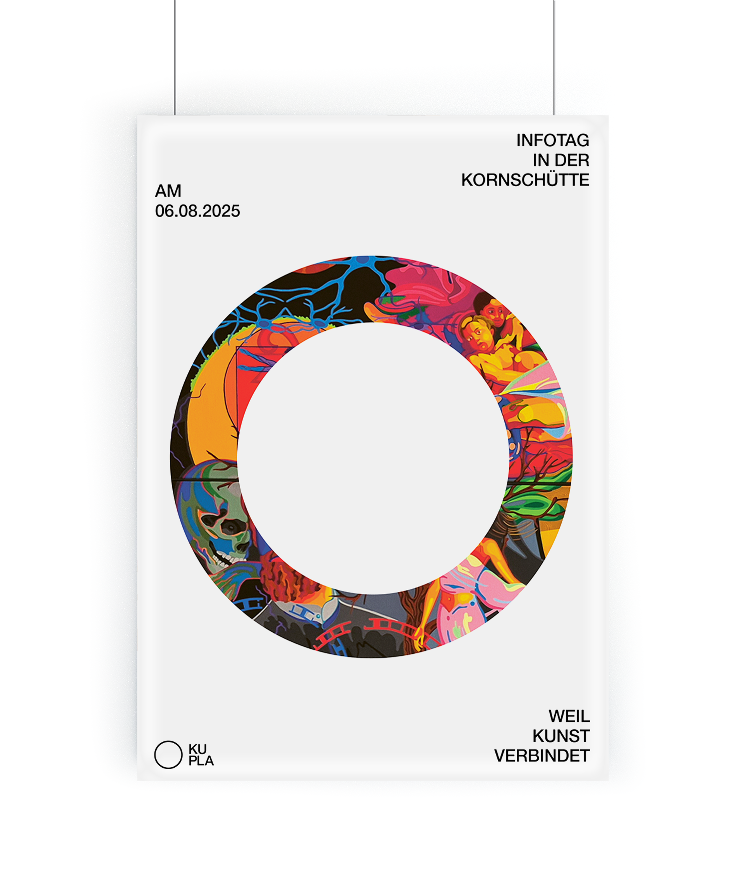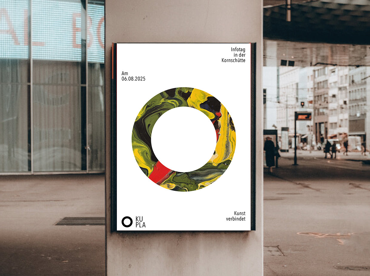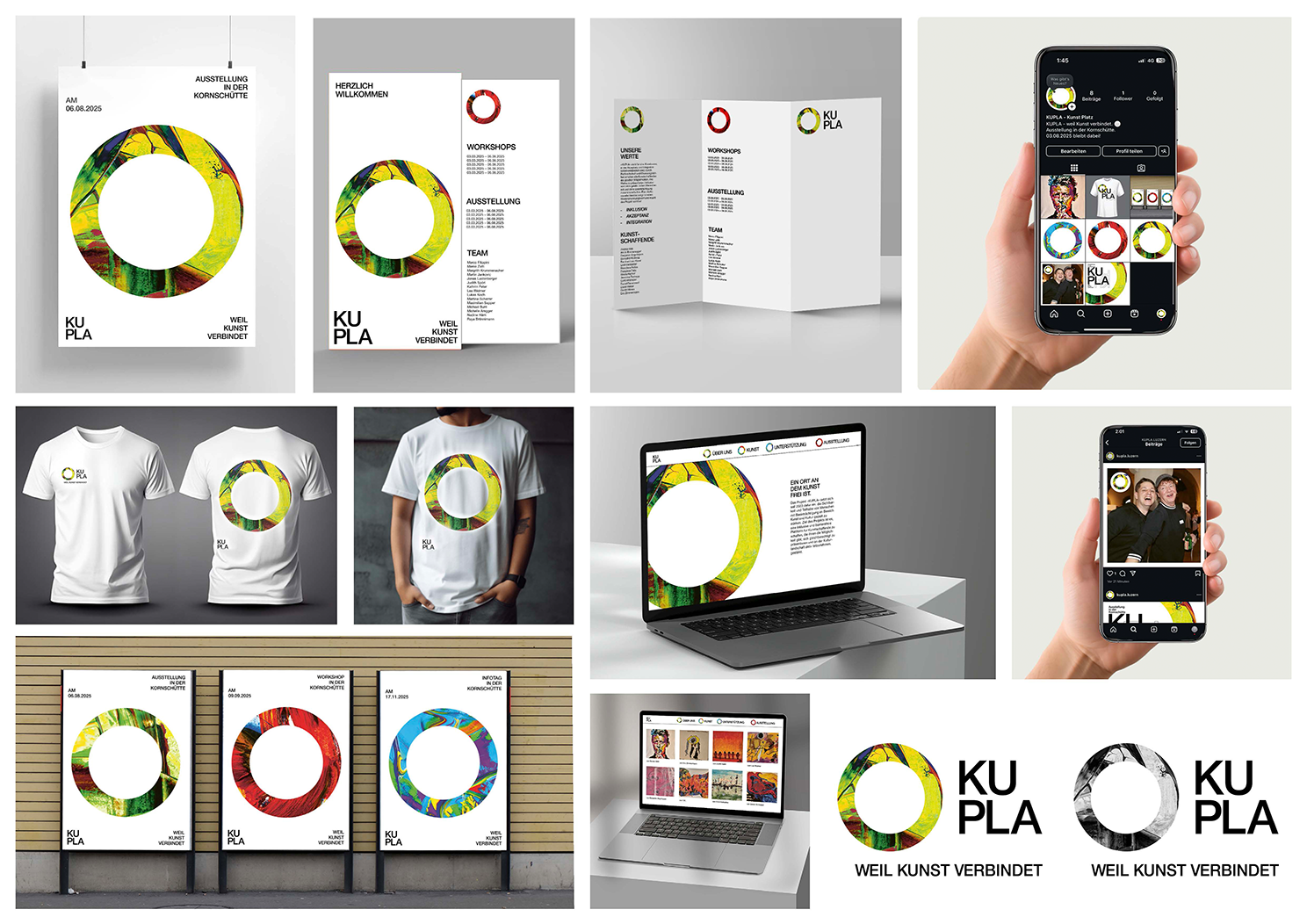
A corporate design for an accessible art platform
What does access really mean? This question marked the starting point of my project. Not just in theory, but in practice: how can design work in a way that reaches as many people as possible, regardless of their individual conditions?
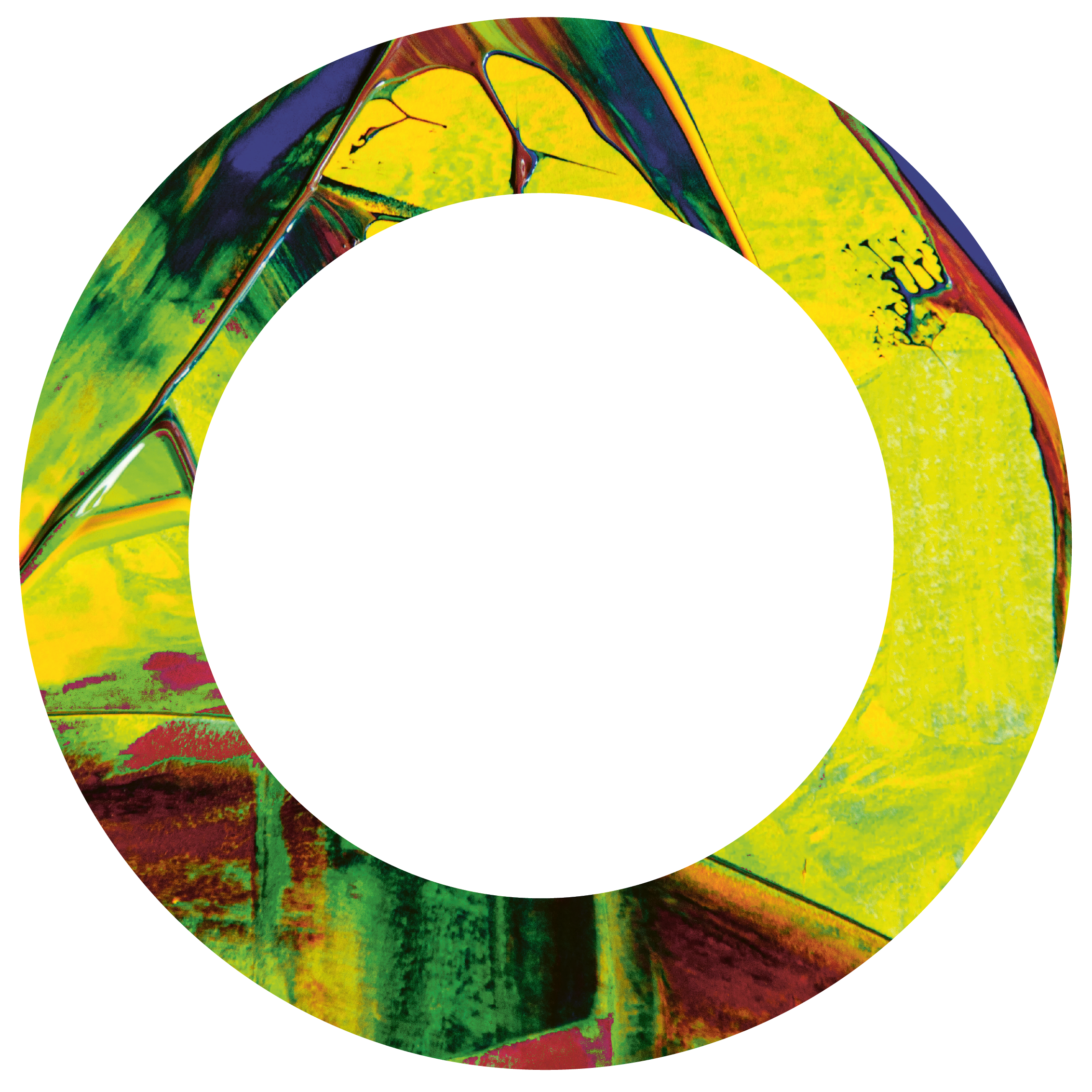
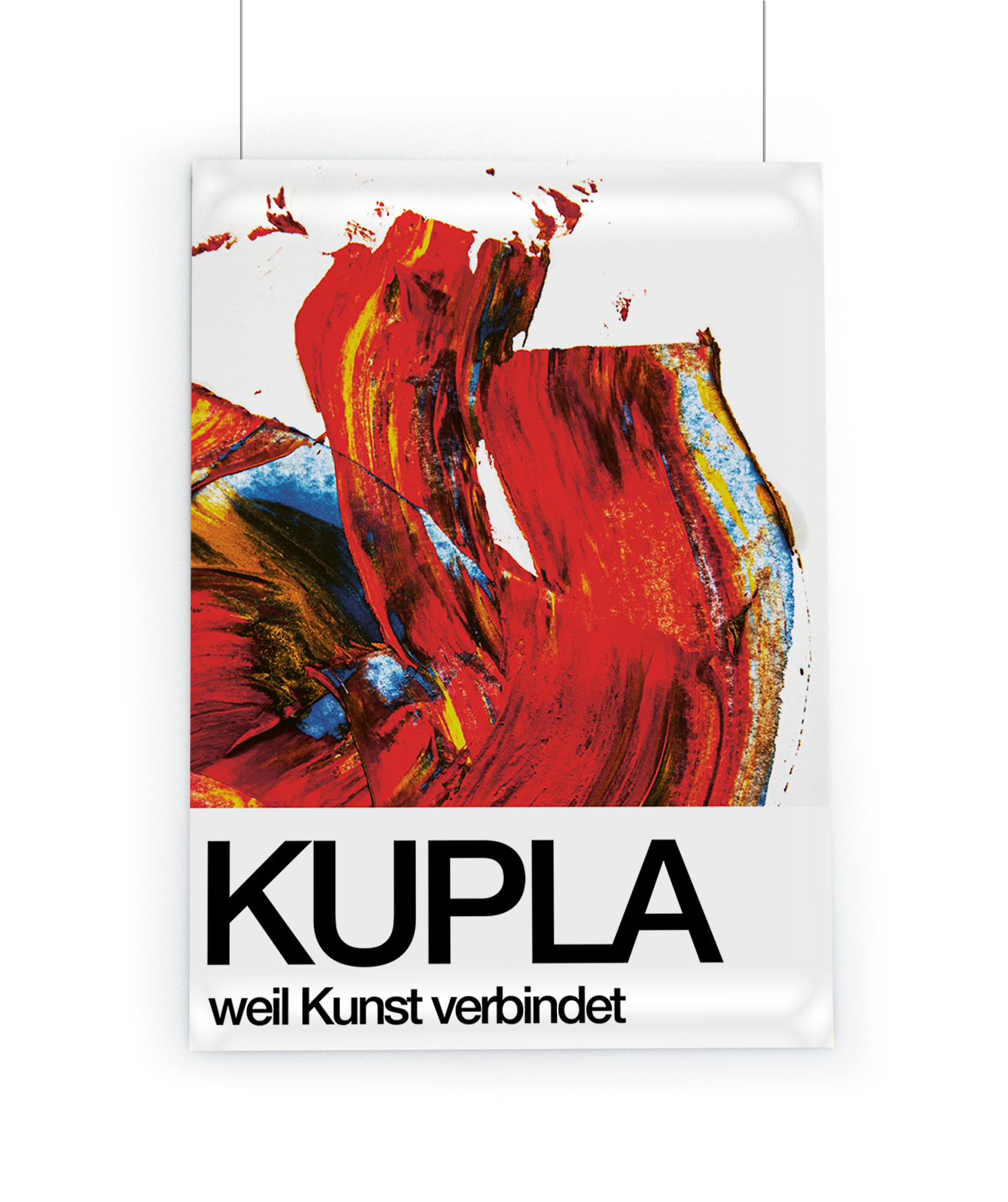
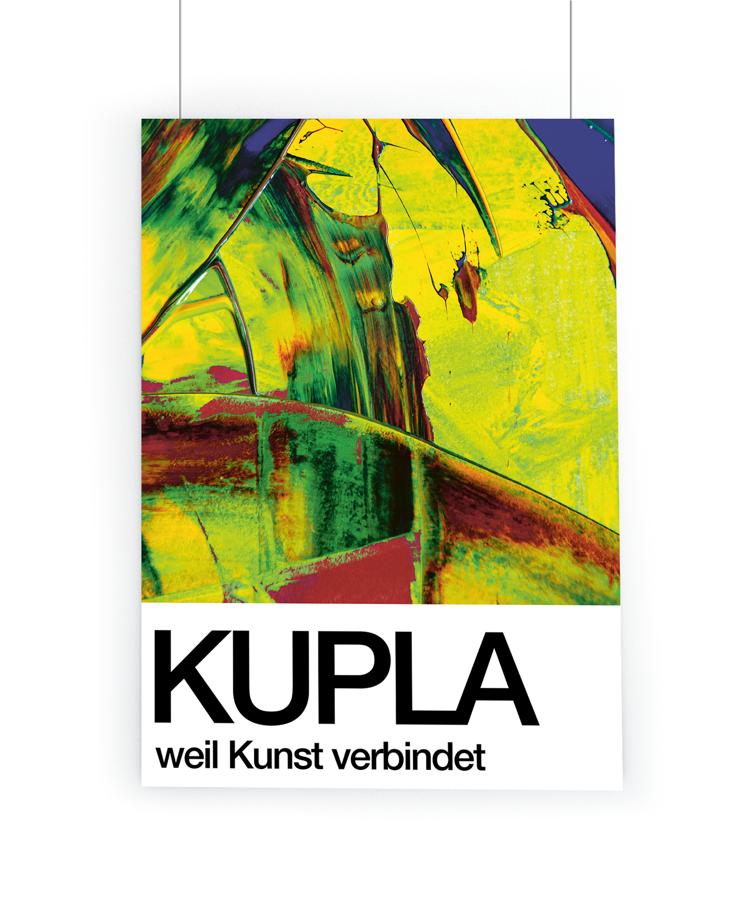
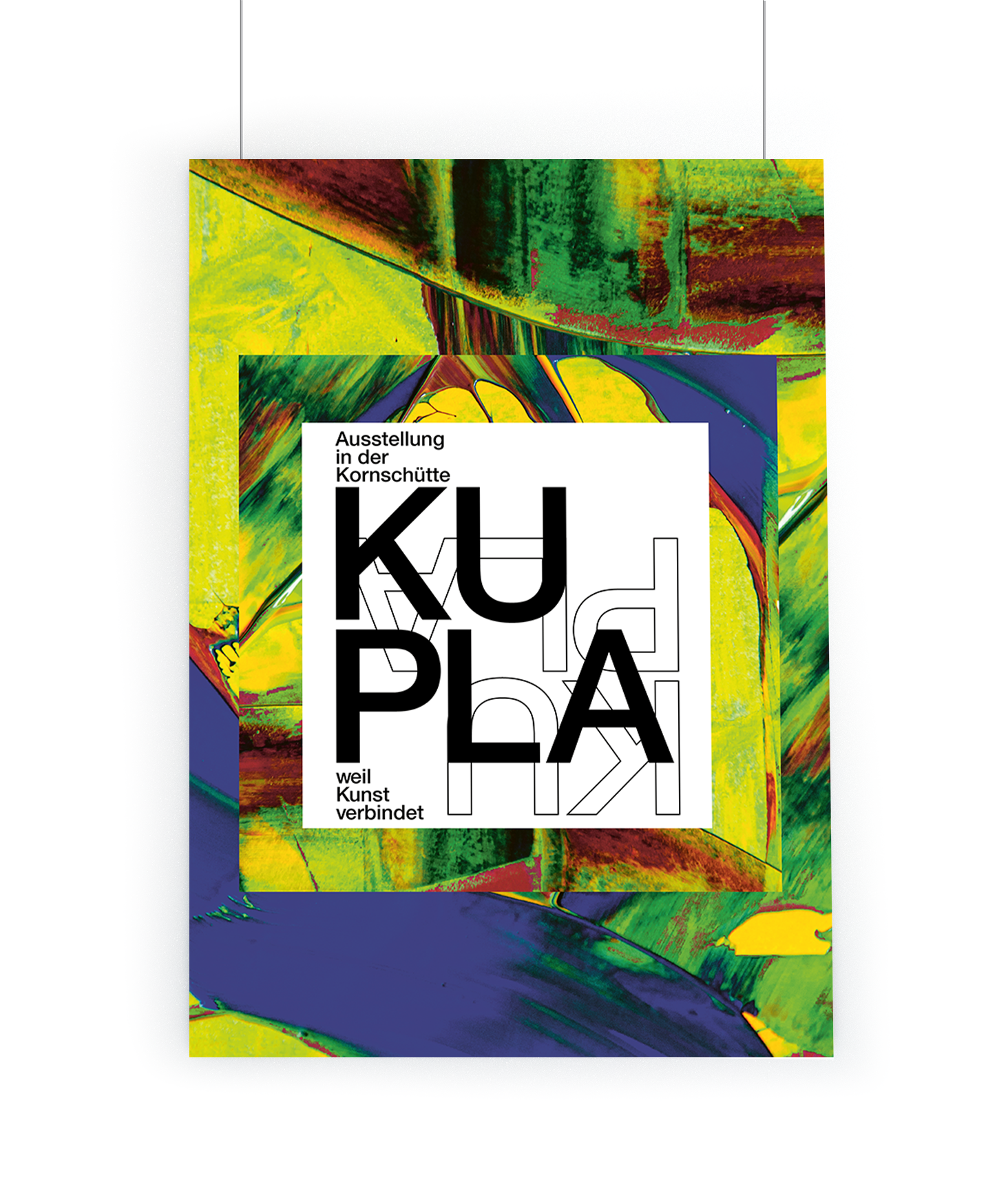
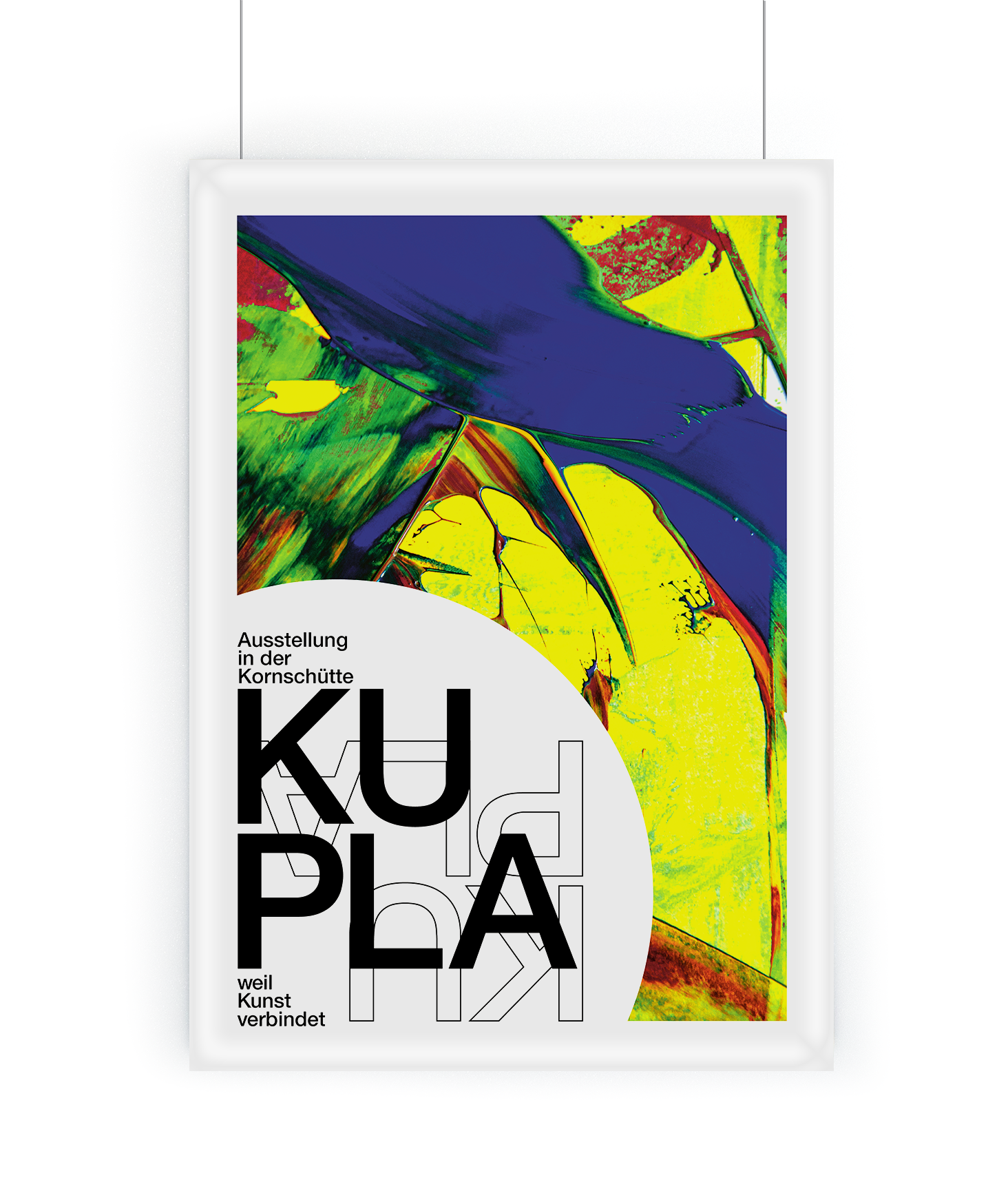
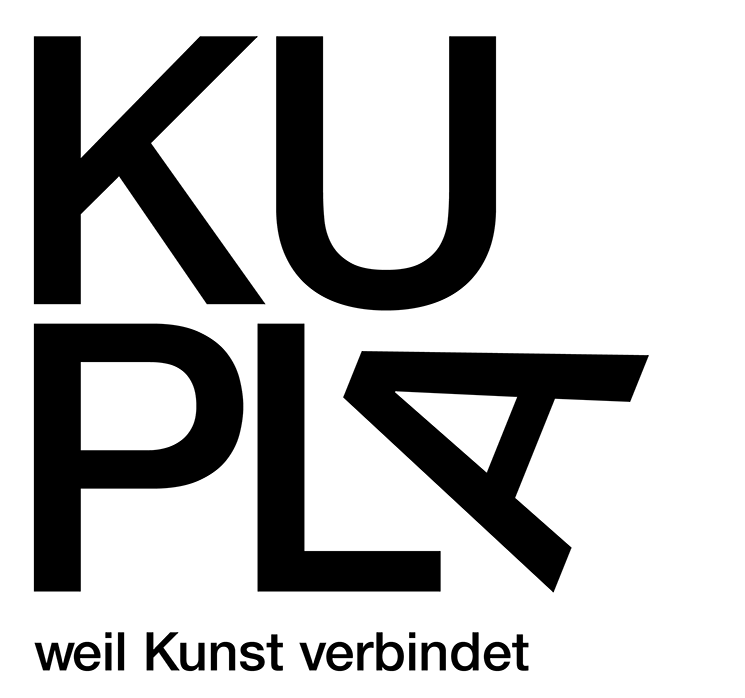
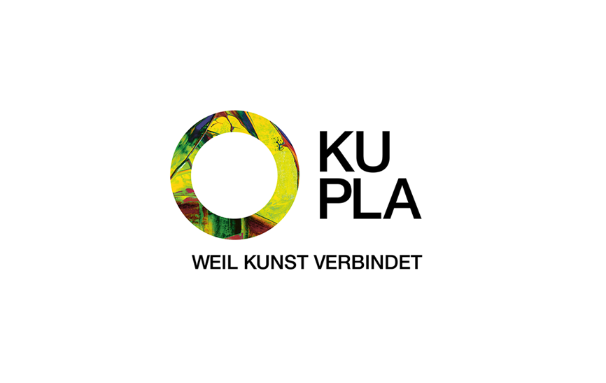
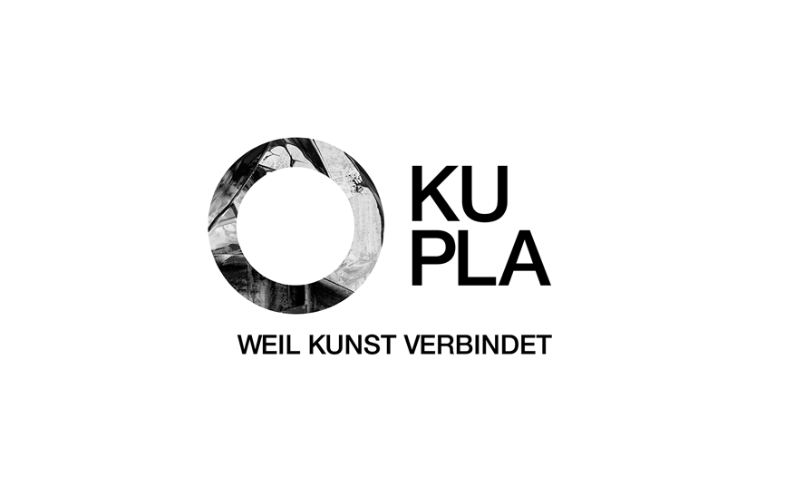
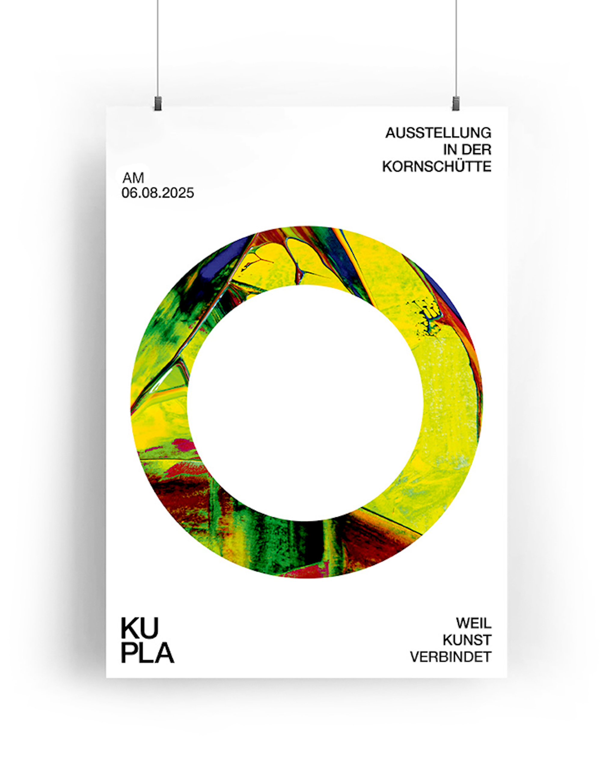
Through intensive research, analysis, concept development, and execution, I created a corporate identity that responds to exactly that. A visual system that is clear, accessible, and reduced, without losing expression. Shapes, colors, and typography are designed to guide while still leaving space.
Accessibility is not an add-on here, but the foundation of the design. It leads without restricting. It communicates without overwhelming. And it adapts instead of dictating.
The result is a visual identity that not only functions, but carries a clear attitude. KUPLA selected this design themselves and now use it as their official corporate design.
2025