ABSTRACT
ABSTRAKT
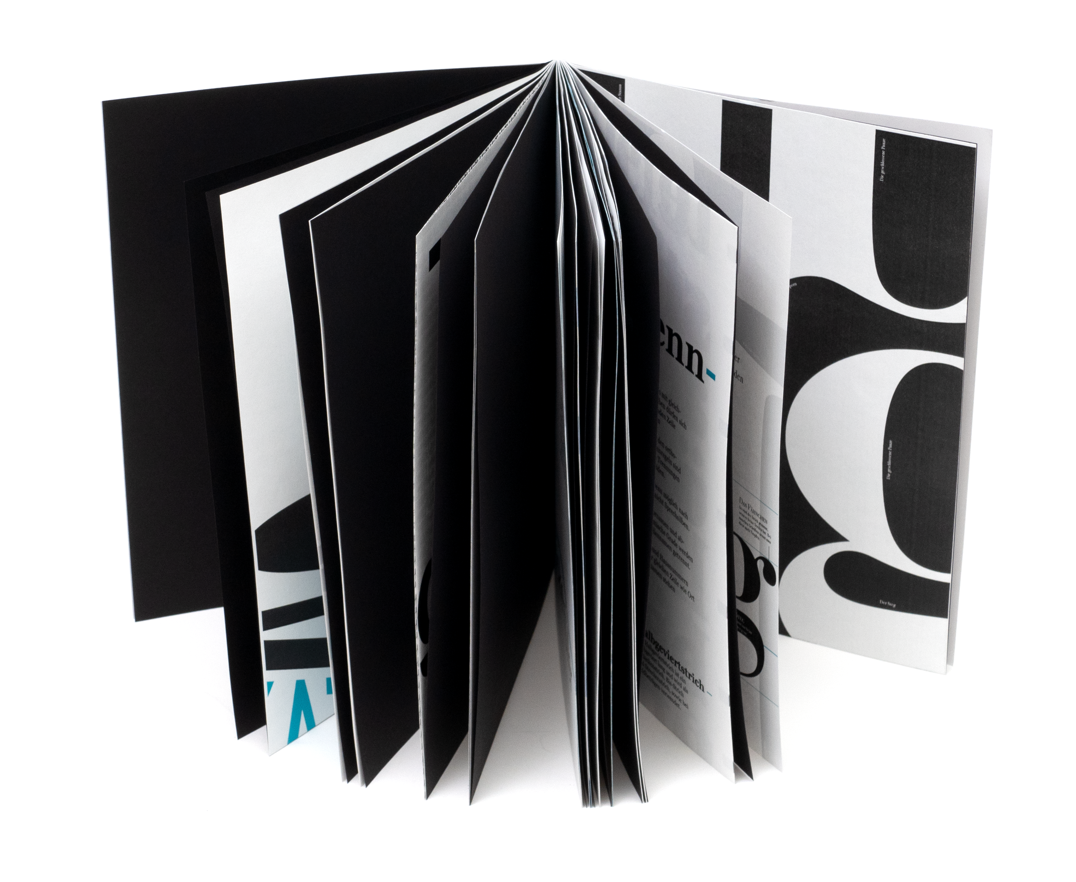
MINIMALISTIC
MINIMALISTISCH
CONTRASTY
KONTRASTREICH
TYPOXIKON
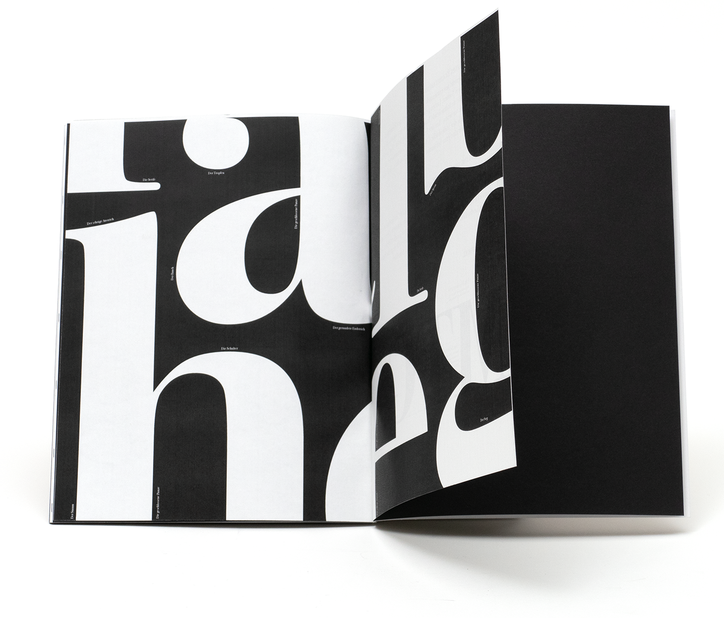
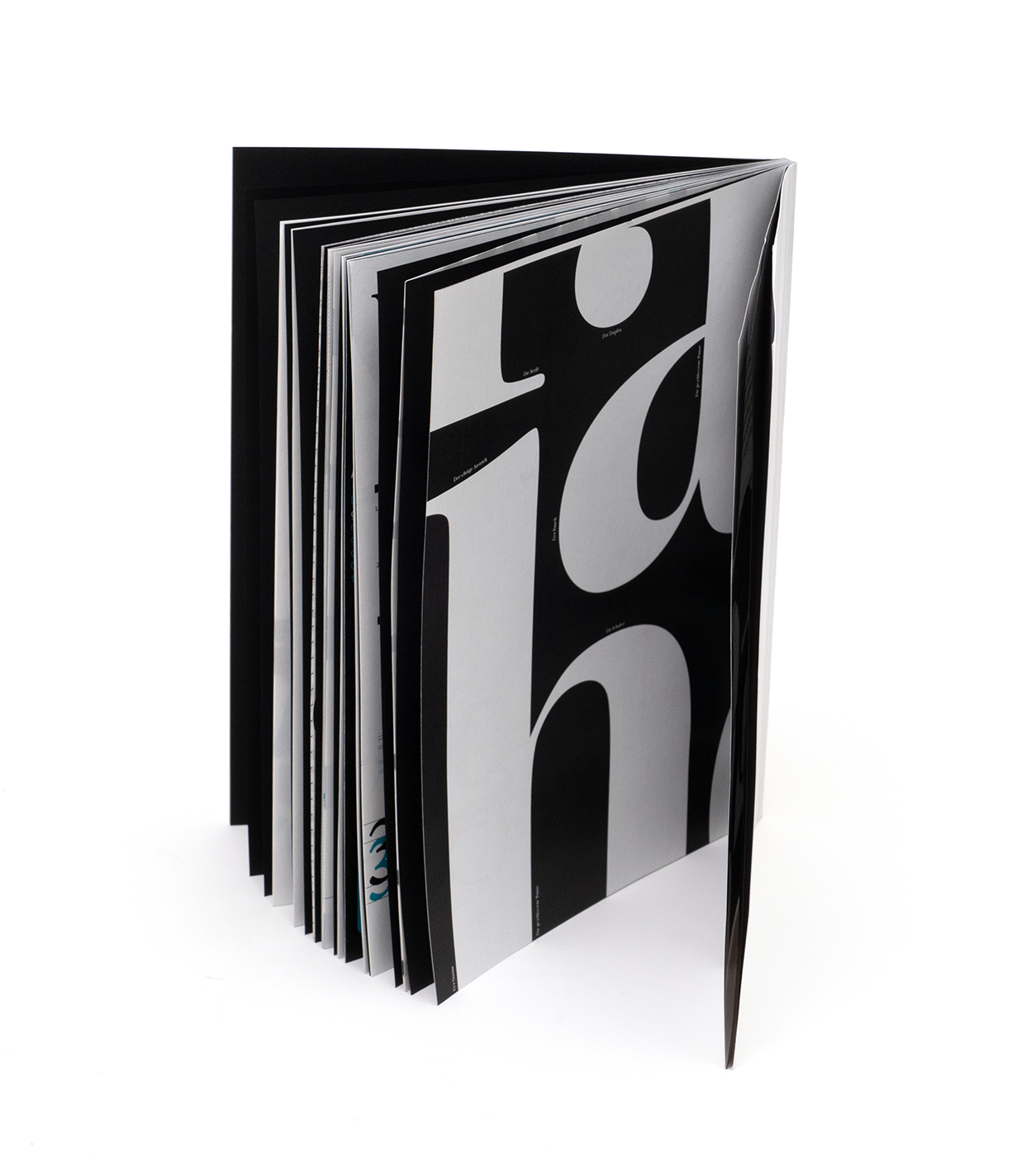
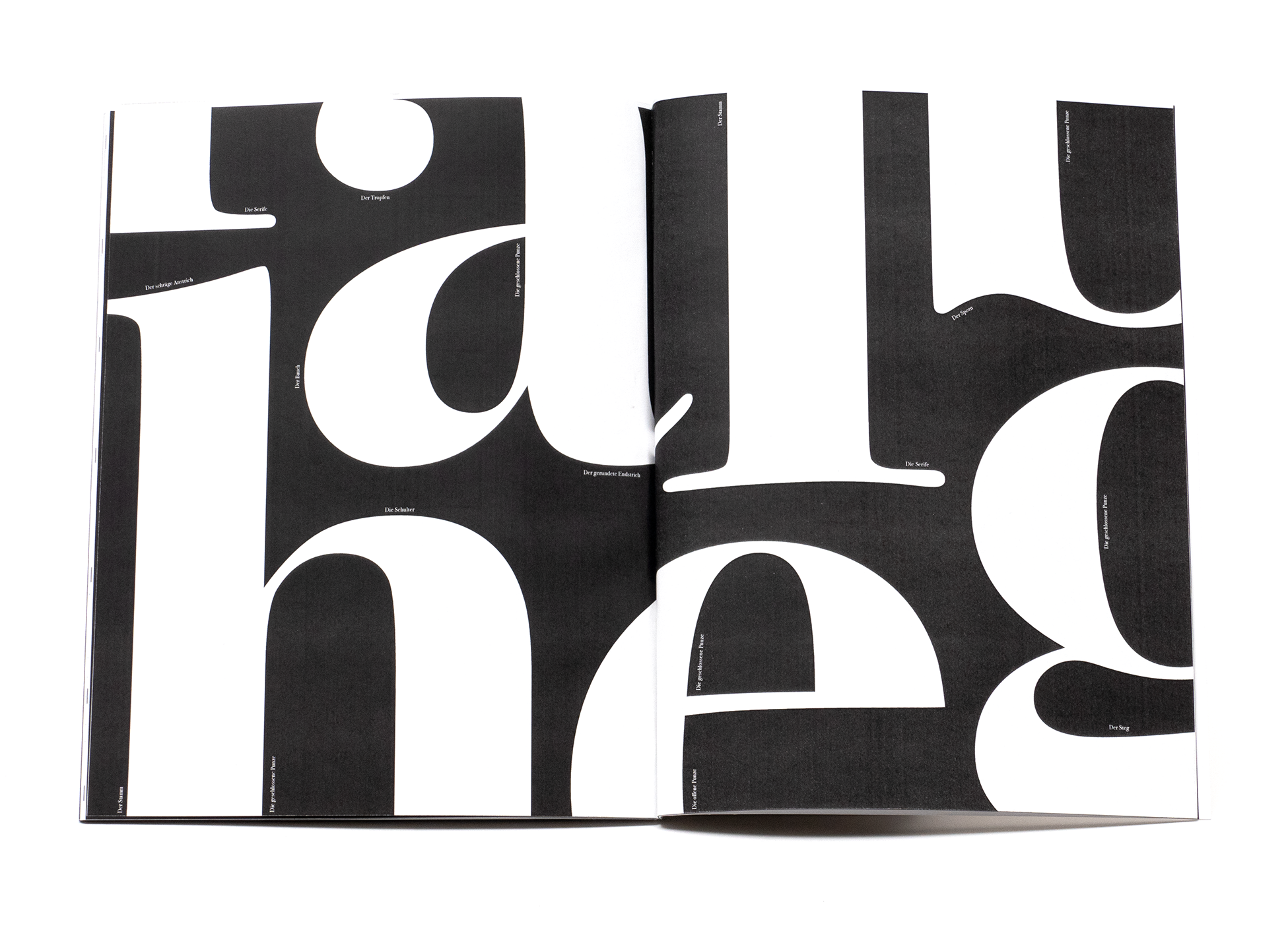
Serifs as a Playful Puzzle
I often find joy in the sight of typography.
Letters can be so different, yet they have so
much in common. A close analysis can be fascinating.
What functional elements actually make up letters?
And which aesthetic aspects come into play?
I'm particularly drawn to serifs. I wondered
how I could bring them together on a double
page in a playful way. The straight lines
and curves of certain letters inspired me
to arrange them like a puzzle.
2021